ShopDreamUp AI ArtDreamUp
Deviation Actions

What an adventure...
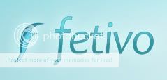
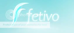
Exactly a year from now, I decided to jump in and try to start a website called Fetivo.
It was supposed to be my personal website, as well as a place where I could feature other artists and talk about design.
Well, it took me months to design a logo, and a full website based on a template.
It turned out that the template I had based my design on was no good because it didn't work in Internet Explorer, and half the planet uses that browser.
So finally, today I had to renew my yearly web hosting and I took the day to REBUILD MY WHOLE WEBSITE onto another template which works in IE.
I also redesigned the logo a bit.
If you want to see my progress, you can go to Fetivo.com and check it out.
As I said, it is still WORK IN PROGRESS.
If you guys have any suggestions regarding the design of the website, then go ahead and tell me!
Old Logo:
New Logo:
Ready to Rock.
I'm guessing it's been so long that you don't even remember me.
I've been inactive for almost a year, ever since I started working on professional projects.
Why? Because DeviantART is very hard to keep up with when you have over 100 messages per week, because I'm now working on paid advertisements and because I'm at University.
But whatever. The important thing is that I'm going to be posting a couple new things in the next coming months.
So! Check out my new avatar, profile and website while you're at it!
CONTINGENCY - Sci-fi Thriller
The filming, editing, VFX, and music of this film was produced by *Stamga:
CONTINGENCY is a short film about a young man that repeatedly attempts to escape a place unknown to him, only to realize that he is not alone...
Tekken Absolution
We have just released a Tekken-inspired live-action video! How awesome is that? Check it out!
The filming, editing, VFX, and music was all produced by *Stamga.
BIONET Web Series
EDIT: The final episodes are finished. You may watch them in the series compilation below.
I know I'm probably bothering you guys with all of this movie production thing, but I've put a lot of effort into my productions and I really need an audience to show them to! That being said, the first episodes of the web series have been released. It does start off a little slow, but after, it's fast paced action till the end!
© 2011 - 2024 Stamga
Comments6
Join the community to add your comment. Already a deviant? Log In
Good! My friend and I are transitioning from having a strictly fun/mess-around website of his that I designed into a full-fledged "branded" (or company) website. Instead of just playing around, we plan on becoming serious and really showcasing his Java abilities and allowing us both to flesh out our goals in life and in technology. It's all very exciting ")
That being said, I am very thrilled to see you pick up again and simply cannot wait to see it come to full fruition. (Smile)")
P.S. I like the new logo a lot better, but the text is much more difficult to read. As ~Roshinrocks suggested, I would combine the two, using the icon from the second and the text from the first. Keep playing around with it (Wink)")
That being said, I am very thrilled to see you pick up again and simply cannot wait to see it come to full fruition.
P.S. I like the new logo a lot better, but the text is much more difficult to read. As ~Roshinrocks suggested, I would combine the two, using the icon from the second and the text from the first. Keep playing around with it